Purple Reign? Pantone’s 2023 Color of the Year Reveals a Royal Trend MABA Massachusetts RealEstate FirtTimeHomeBuyers
Pantone just announced its 2023 Color of the Year. And for the third time in seven years, the hue is something you could describe as a shade of purple.
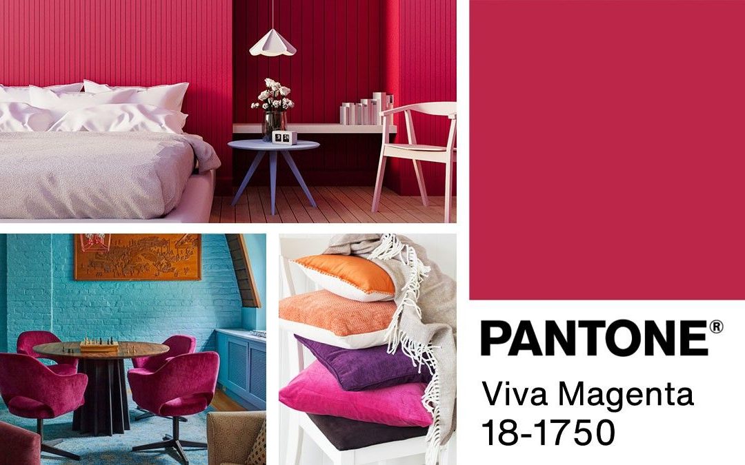
The new top color: Viva Magenta! While the shade is more pink-leaning than its purplish predecessors (including last year’s winner, Very Perri, and 2018’s Ultra Violet), it’s still a bold plum that pulls in both red and blue hues.
So how is this color—once reserved for children’s toys and velvet maxi skirts—suddenly making a comeback in high-end interiors? We asked designers to dish on the details, and they divulged their expert do’s and don’ts for decorating with purple.
What’s so special about purple?
Before we get too plum-crazy, it’s helpful to know why the color is having such a moment in the first place. One theory? It helps us get in touch with our inner royals.
“Purple is a rare color in nature, so it’s viewed as intriguing and mysterious,” says Bynn Esmond, principal of Bynn Esmond Designs. “So much so, that purple was reserved as the color of royalty back in ancient times. It symbolized wealth and power.”
Beyond the enigmatic and luxurious aspects of purple, there are the dynamic color’s parent hues to appreciate: red and blue.
Purple and purple variants “are so enduring, because they are all combinations of the far ends of the visual spectrum of blue and red,” says designer Meri Goldstein. “Using purple in home interiors can impart either coolness or warmth to a room—often both at the same time. Purples are also highly evocative of mood, and so they can be used to great effect in defining a room’s character.”
How to use purple in your home decor
Now that you know a bit more about why Pantone (and everyone else) is so obsessed with all things purple—from periwinkle to magenta—here are some practical ways to incorporate these bold hues into your interior design.
Do: Use purple to define large spaces
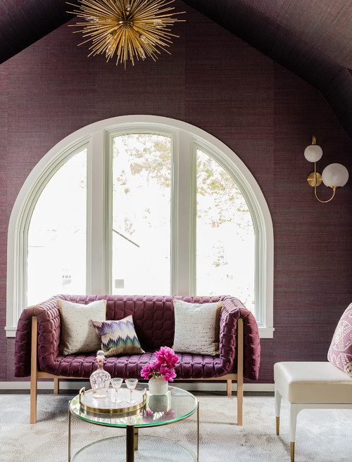
“I love using darker shades to define the structural features of walls,” says Goldstein. “Aubergines, plums, and eggplants are particularly effective in defining pilasters and recesses. And they help to draw attention to the dimensions of a space in ways that grays and whites can never do.”
When it comes to painting with purples, Goldstein recommends choosing a shade that’s either very light or very dark and using it on “one or maybe two walls at most.”
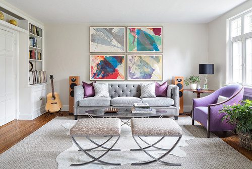
Do: Incorporate purple with smaller decor elements
Beyond using various shades of purple to highlight structural elements in your home, you might also use it in your decor choices, says Amber Dunford, style director for Overstock.com.
“Try working purples into your space on a velvet chaise or side chair,” she suggests. “For those on the more conservative side with color, look for artwork that includes pastels with lavender—or some chalky lavender-colored throw pillows on a soft white sofa.”
How to avoid purple overload
As tempting as it is to go all in with purple, there are some times to avoid it—or shall we say, tone it down a bit.
Don’t: Pair purple with too many reddish hues
“This is a color I would avoid using in large doses, as it can overpower the space and lose the positive psychological impacts,” says Dunford. “I might also avoid pairing a color like Viva Magenta with an abundance of reds.”
A mixture of too many purples and reds can lead to eye fatigue.
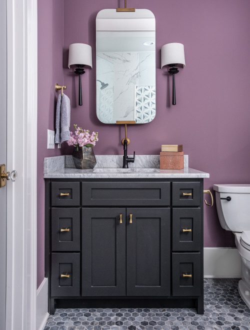
Don’t: Go too purple in your main living space
Another way to limit your purple intake? Enjoy the vibrant shade in areas where you won’t be spending all your time. For example, Goldstein discourages purple in high-activity or big-energy spaces, such as kitchens and family rooms.
Instead, use the hue sparingly in those areas—with just one or two small design elements.
“To avoid purple overload for our clients, we chose to use it in a small powder room,” says Esmond. “The powerful purple made the powder room look larger because of [an] oversized pattern of the wallpaper. People can also choose a smaller accent wall or furniture piece to feature purple.”
The post Purple Reign? Pantone’s 2023 Color of the Year Reveals a Royal Trend appeared first on Real Estate News & Insights | realtor.com®.

FIRST TIME HOMEBUYERS
Buyer’s Agents Explained
Client Testimonial:
 "No amount of reading or web surfing can equal having a competent professional advising you and looking out for your interests. I do not understand why anyone would buy a house in MA without a MABA buyer's broker."
- Samantha and Brendan, Purchased a home in Marlborough, MA 2012
Article From: "Larissa Runkle" Read full article
Get Started with MABA
For no extra cost, let a MABA buyer agent protect your interests
800-935-6222 Call now!
How to Make Better Homebuying Decisions

Who Pays a Buyer’s Agent?

![]()